
Sugarwish Redesign
The Challenge
In today’s competitive e-commerce landscape, user experience is the key differentiator. For Sugarwish, a brand known for its unique, customizable gifting experience, the marketplace page is a vital touchpoint where the magic of personalized gifting begins. However, the existing design struggled with intuitive navigation, visual clutter, and an inconsistent flow, making it difficult for users to fully appreciate the seamless, personalized process Sugarwish offers. Our mission was to revamp this marketplace interface, aligning it with the brand’s ethos of joy, simplicity, and personalization. As a two-person team, we tackled this challenge with a user-centered approach, delving deep into user pain points, analyzing behaviors, and crafting a strategic plan for improvement. The goal was to transform the marketplace into an intuitive, delightful space, guiding users effortlessly from product discovery through customization to checkout. This case study captures our journey from initial research to prototype, showcasing our process, insights, and the decisions that shaped a streamlined, engaging, and user-friendly experience that meets both user expectations and business goals.
Problem Statement
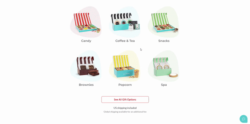
Sugarwish sought a comprehensive overhaul of their product, with a particular emphasis on the Marketplace. The goal was to address user frustrations with the multi-step checkout process, visual clutter, and inconsistent navigation. By focusing on the Marketplace, we aimed to create a seamless, intuitive experience that aligned with Sugarwish's ethos of joy, simplicity, and personalization, while ensuring users could effortlessly navigate from product discovery to checkout.
🔍 Researching
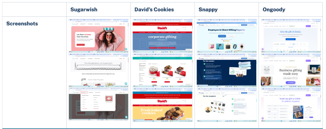
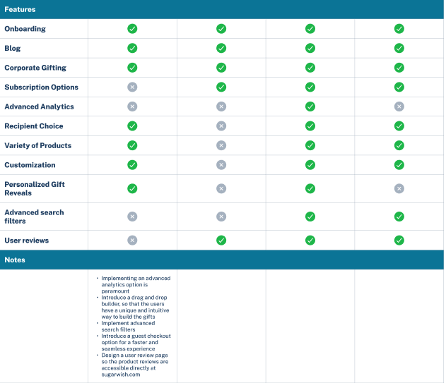
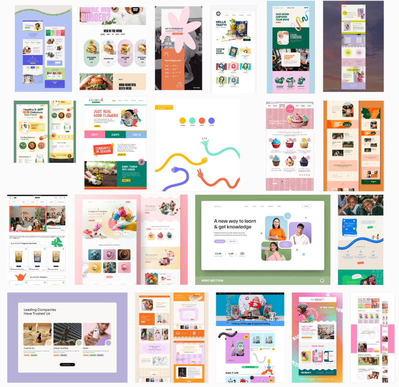
Analyzing similar platforms like Snappy and Ongoody’s gift sections gave me valuable insights into effective design strategies. I noted the best practices in product categorization, filter systems, and the emphasis on customization features, highlighting areas where Sugarwish could improve.
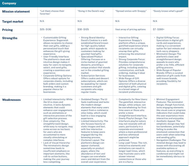
The competitive analysis revealed gaps in competitors' offerings, allowing us to address unmet customer needs and refine our marketing strategies. For example, while one competitor excels in customer service, their higher pricing creates an opportunity for us to attract cost-conscious consumers. Insights from the analysis also highlighted the importance of social media engagement, inspiring us to adopt similar tactics that boosted our brand awareness. Ultimately, this process clarified our unique value proposition and informed strategic decisions across departments to drive growth.
👥 Creating Your Average User’s Needs
User Persona
Key Needs:
Being “underteamed’, we decided to cut one persona short and leaned into the gift giving aspect of Sugarwish, particularly the more corporate side of their product. Our main user was the Gift Giver. Gift Givers: Want a straightforward and fast way to select and personalize gifts. Value the ability to filter products based on categories, preferences, or themes. Prefer a clean and visually appealing interface that guides them effortlessly from product selection to checkout. Further, we crafted a thorough user persona that filled those needs.
📊 Analyzing
Analyzing the product’s layout, I came to the conclusion that there was a lot of excess white space and that it needed to be filled. Thus, the moodboard further reflected that sentiment and we set out to correct that oversight
🗺️ Mapping Your Product
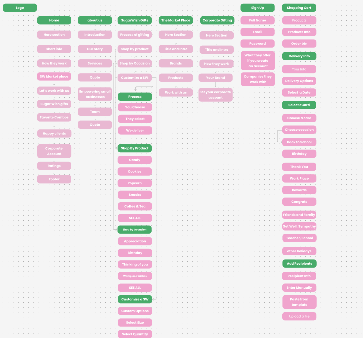
One key point from mapping the product was the focus on streamlining the user journey. We identified that the marketplace needed a clearer flow, where users could easily transition from discovering products to personalizing their gifts. This meant simplifying product categories, refining filters, and ensuring that customization options were more prominent and accessible. The goal was to create a seamless path that would reduce confusion and increase user engagement from start to finish.
📐 Framing Your Wires
We designed a clean, minimalist wireframe that prioritized easy navigation. Key features like product categories, filters, and customization options were prominently placed for quick access, while unnecessary elements were removed to reduce visual clutter.
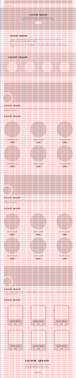
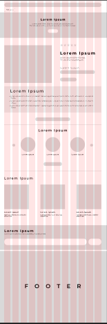
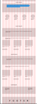
Additionally, I ensured that the customization options were easily discoverable. The wireframes emphasized clear calls-to-action for personalization, creating an intuitive flow that guided users smoothly through the gift selection and customization process. This helped set the stage for a user-friendly, personalized experience.
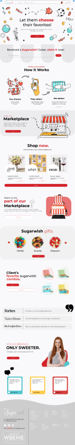
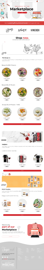
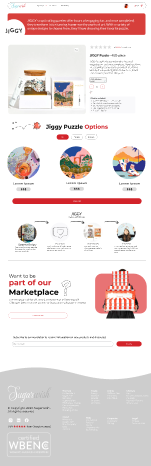
🎨 Designing Your Product
Design System Highlights:
- Color palette: #D2232A (primary), #000000 (text)
- Typography: Lato and Montserrat
🛠️ Prototyping
Interactive prototype demonstrating
Tools Used:
- Figma
- Figjam
🎉DING! All Done
Final outcome: For the final outcome, we were not appraised of what transpired regarding the final result, but I would like to think we made a significant impact on the product's performance on the market.