Sparkasse - VibeOn
The Challenge
In a high-energy Sparkasse hackathon, the challenge was laid out clear as day: how can we demystify finance for Gen Z? Sparkasse wanted to break away from traditional, often intimidating financial education and engage a generation that lives and breathes digital experiences. The task was bold—a brand new platform built from scratch that not only informs but excites.
Problem Statement
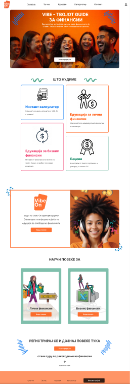
Until now, there was no platform that effectively demystified finance for Gen Z. We created an entirely new platform from scratch to address this gap, making financial education engaging, intuitive, and accessible.
🔍 Researching
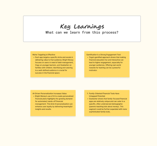
Our journey began with a deep dive into understanding Gen Z. We sifted through emerging trends, user behaviors, and insights on digital learning. It became evident that Gen Z craves interactivity, instant feedback, and content that speaks their language. In the limited time of a hackathon, our team had to quickly synthesize this research, pinpointing the pain points of traditional finance education and the desires of a new, tech-savvy audience.
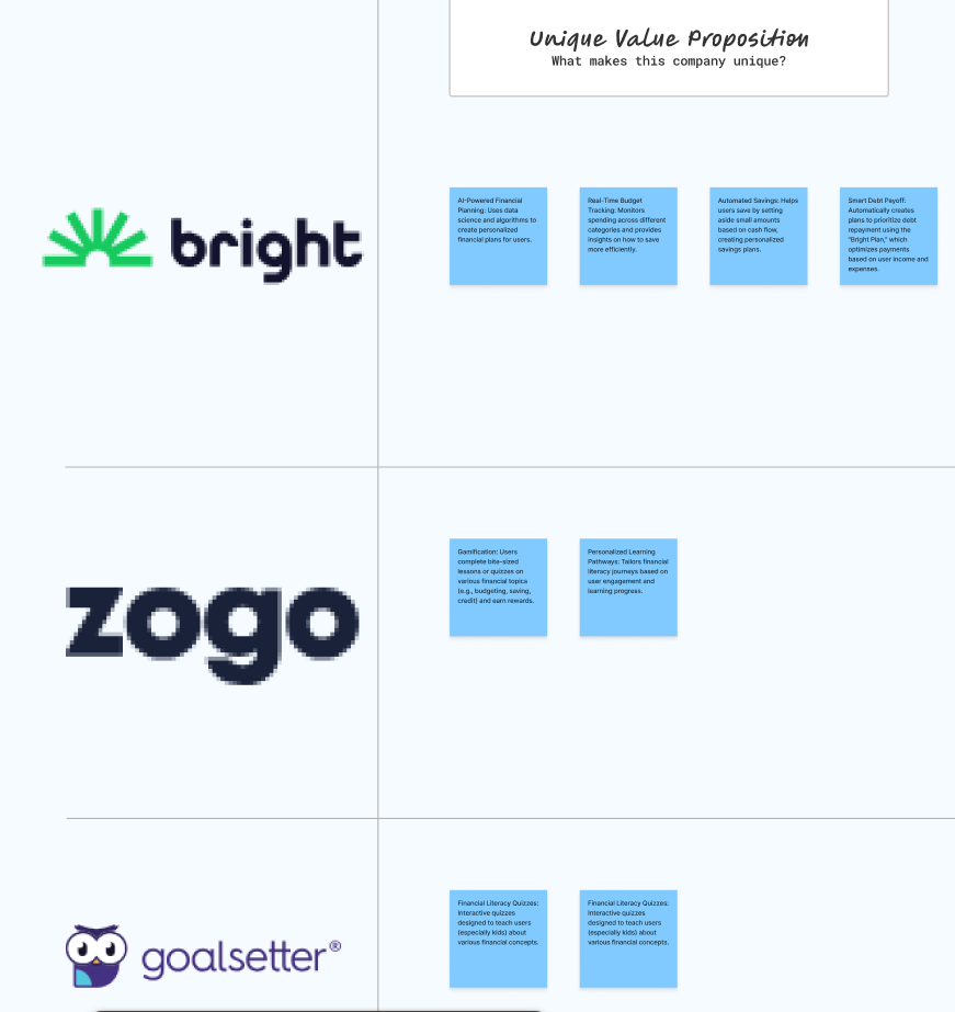
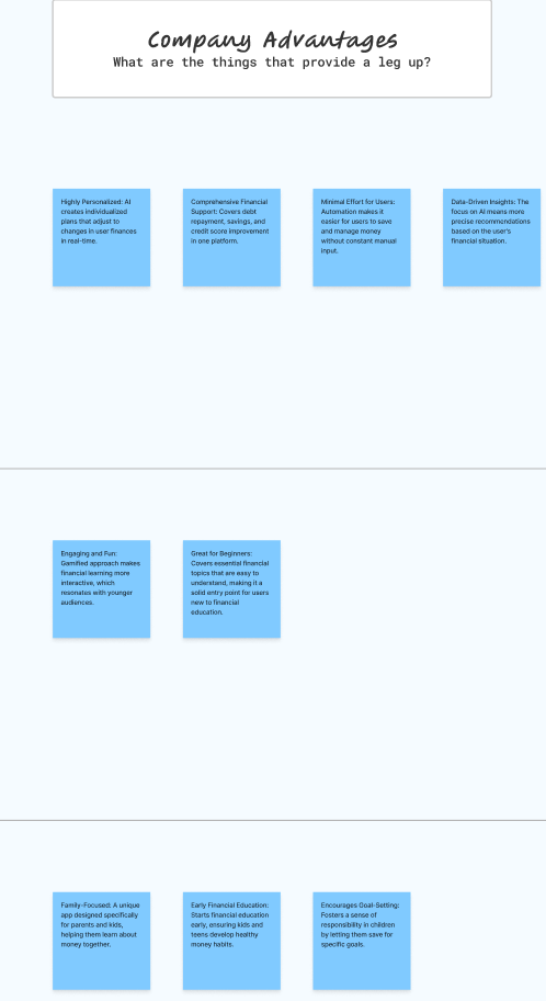
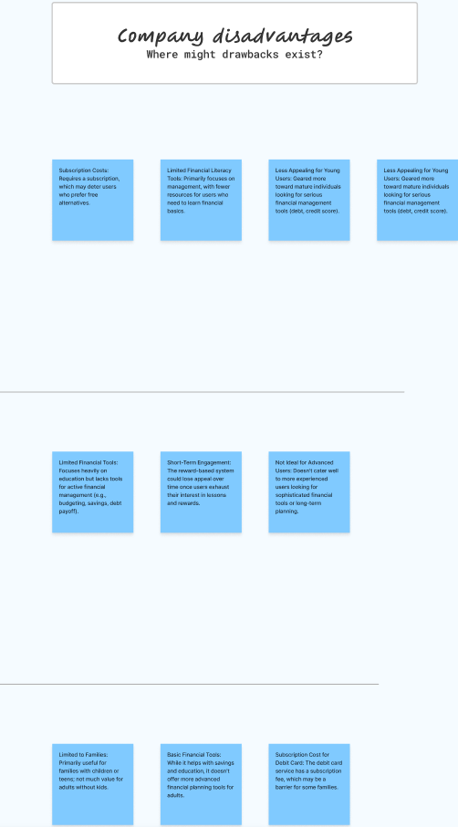
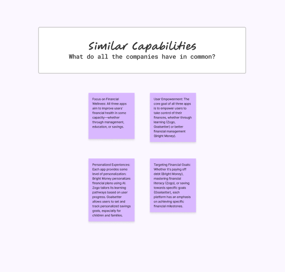
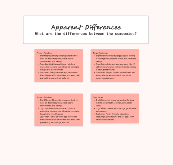
The competitive analysis revealed gaps in competitors' offerings, allowing us to address unmet customer needs and refine our marketing strategies. For example, while one competitor excels in customer service, their higher pricing creates an opportunity for us to attract cost-conscious consumers. Insights from the analysis also highlighted the importance of social media engagement, inspiring us to adopt similar tactics that boosted our brand awareness. Ultimately, this process clarified our unique value proposition and informed strategic decisions across departments to drive growth.
👥 Creating Your Average User’s Needs
User Persona
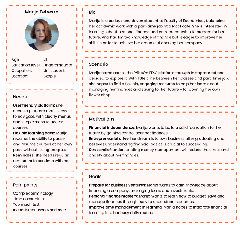
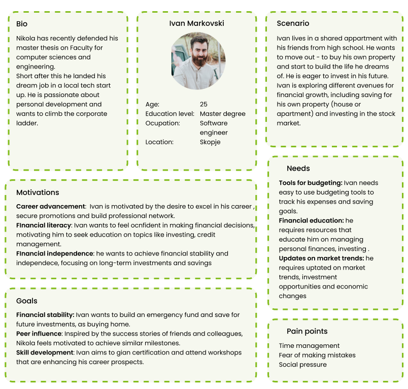
Key Needs:
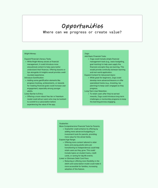
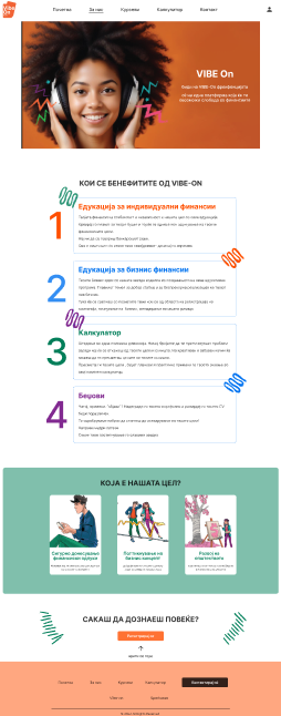
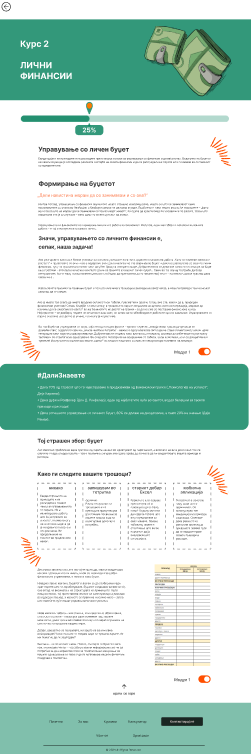
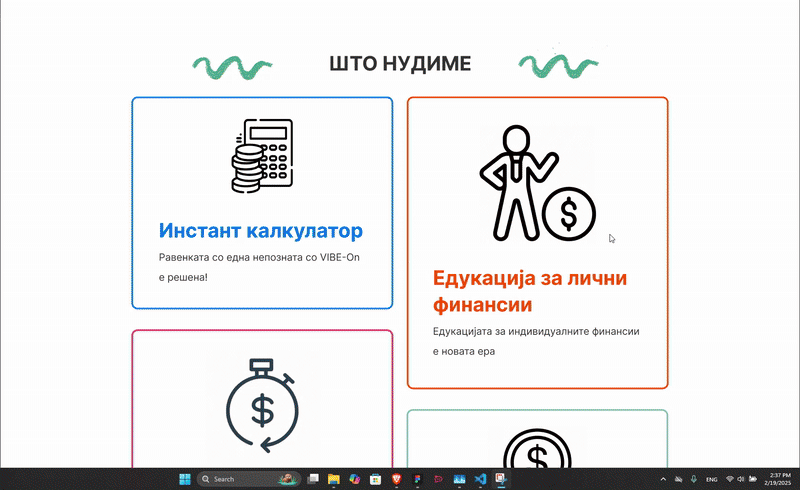
Armed with research, we mapped out the core needs of our future users. Gen Z demanded a platform that was visually engaging, intuitive, and packed with bite-sized learning modules. The traditional heavy-handed approach to financial education was out; what was in was an experience that felt like a game, complete with rewards and community challenges. Every design decision was driven by the goal to make finance feel accessible and even fun.
📊 Analyzing
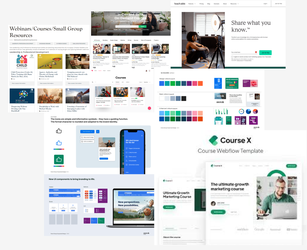
In our analysis phase, we broke down the typical barriers that make finance seem daunting. We pinpointed issues such as complex jargon, monotonous content, and clunky navigation. The takeaway? Simplify, simplify, simplify. This understanding steered us toward a design that integrated clear, friendly language and a layout that invited exploration rather than overwhelming the user. Our moodboard reflects these opinions and ideas.
🗺️ Mapping Your Product
With our insights in hand, we began to map out the user journey. The envisioned product started with a compelling onboarding experience that quickly drew users in. From there, the journey moved seamlessly through interactive lessons, real-time progress tracking, and social elements that allowed for friendly competition. Our product map served as the blueprint that captured every interaction and transition, ensuring that each step resonated with Gen Z’s expectations.
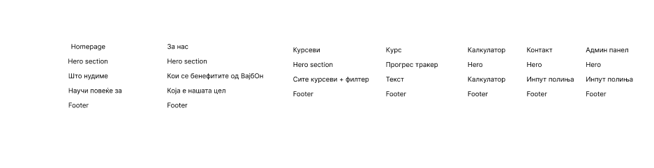
📐 Framing Your Wires
The next phase was all about wireframing. In the midst of the hackathon’s rapid pace, our sketches quickly evolved into digital wireframes. We iterated at breakneck speed, testing flows and rethinking layouts until every screen felt right. These wireframes were more than rough drafts; they were the structural backbone of our platform, laying the groundwork for the intuitive user experience we were determined to achieve.
Every iteration was a leap toward perfection, each wireframe a step closer to a user experience that felt natural, engaging, and unmistakably modern.
🎨 Designing Your Product
Design System Highlights:
- Color palette: #FF4F00 (primary), #007E59 (secondary), #0072F0 (tertiary), #000000 (text)
- Typography: Inter
🛠️ Prototyping
In the final stretch of the hackathon, our designs were transformed into a working prototype. This stage was a blend of art and science: an interactive model that allowed us to test user flows, gather immediate feedback, and make rapid refinements. The prototype was our first live glimpse into how Gen Z would interact with the platform, and it proved that even under intense time constraints, innovative ideas could be translated into a tangible, user-friendly product.
Tools Used:
- Figma
🎉 DING! All Done
Final outcome: When the final results were announced, our solution wasn’t chosen. Yet, in that moment, what we gained was far more valuable than any trophy could offer. The hackathon’s crucible of creativity and pressure had already transformed our approach to financial education for Gen Z. While our platform didn’t secure the winning slot, every late-night brainstorming session, every rapid prototyping sprint, and every iteration in our design process fueled a deeper understanding of our users’ needs and the future of digital finance learning. That final moment was bittersweet—a mix of disappointment and the spark of renewed determination. Instead of resting on our laurels, we recognized the incredible learning experience this journey provided. We emerged with fresh insights into user engagement, a more resilient design strategy, and a passion to continue innovating. Our project may not have clinched victory at the hackathon, but it laid the groundwork for future breakthroughs, proving that sometimes the real win is in the lessons learned and the courage to push boundaries.