
OutLearn
The Challenge
High schools struggle to engage students with diverse learning styles and academic needs. Teachers lack tools to track progress efficiently, while students feel overwhelmed by rigid, one-size-fits-all platforms. A district sought a solution to:
- Personalize learning experiences for students
- Empower teachers with data-driven insights
- Improve student engagement and academic outcomes
Problem Statement
This project was undertaken as part of a 48-hour hackathon, where the challenge was to design a solution that addressed the inefficiencies in personalized learning platforms within a limited timeframe.
🔍 Researching
I developed three user personas—Alex (the Educator), Sofia (the Student), and Michael (the Parent)—to ensure the platform meets the diverse needs of its users. These personas helped shape the design decisions to elevate the platform's usability and engagement.
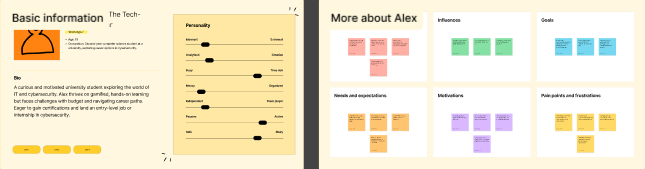
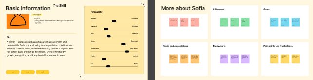
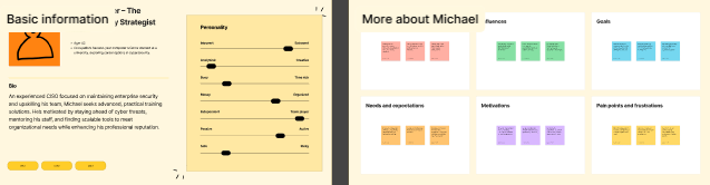
Meet our three user personas: 1. Sofia, the Educator: A high school teacher who values tools that simplify lesson planning and provide real-time insights into student progress. 2. Alex, the Student: A tech-savvy learner who thrives on interactive and personalized learning experiences tailored to his pace and interests. 3. Michael, the Parent: A busy professional who wants to stay informed about her child's academic performance and appreciates platforms that offer clear communication and progress tracking. These personas guided our design decisions, ensuring the platform meets the diverse needs of educators, students, and parents alike.
👥 Creating Your Average User’s Needs
Moodboard
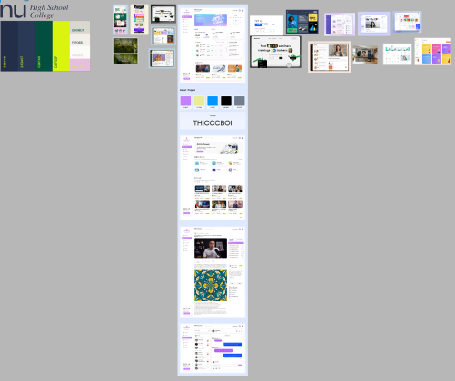
Key Needs:
Our moodboard emphasized clean, minimalist designs with a focus on dashboards and intuitive homepages. We drew inspiration from platforms that prioritize clarity and functionality, ensuring that the user experience remains seamless and visually appealing. This approach helped us create a design that balances aesthetics with usability, catering to the needs of both novice and experienced users.
📊 Analyzing
Analyzing the product’s layout, I came to the conclusion that there was a lot of excess white space and that it needed to be filled. Thus, the moodboard further reflected that sentiment and we set out to correct that oversight
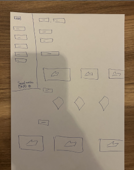
🗺️ Mapping Your Product
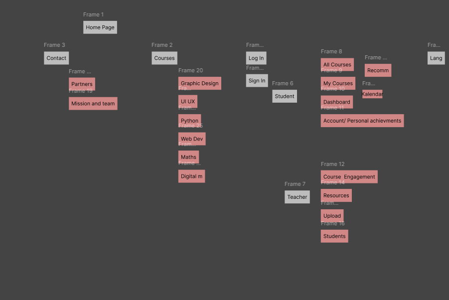
One key takeaway from mapping the product was the emphasis on creating a streamlined and intuitive user journey. The sitemap reflected a minimalist approach, focusing on clarity and simplicity. We ensured that users could easily navigate from discovering products to personalizing their gifts. This involved simplifying product categories, refining filters, and making customization options more prominent and accessible. The goal was to design a seamless flow that reduced confusion and enhanced user engagement from start to finish.
📐 Framing Your Wires
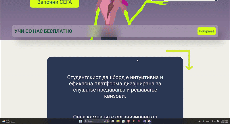
We designed simple, easy-to-navigate, and understand layouts for the homepage and the dashboard. Key features like product categories, filters, and customization options were prominently placed for quick access, ensuring a seamless user experience while maintaining a clean and minimalist design.
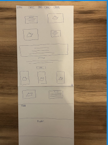
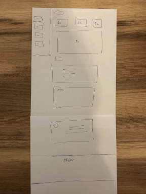
Additionally, I ensured that the navigation options were easily discoverable. The wireframes emphasized clear calls-to-action for exploring and selecting lessons, creating an intuitive flow that guided users smoothly through the process of finding appropriate learning materials. This helped set the stage for a user-friendly, educational experience.
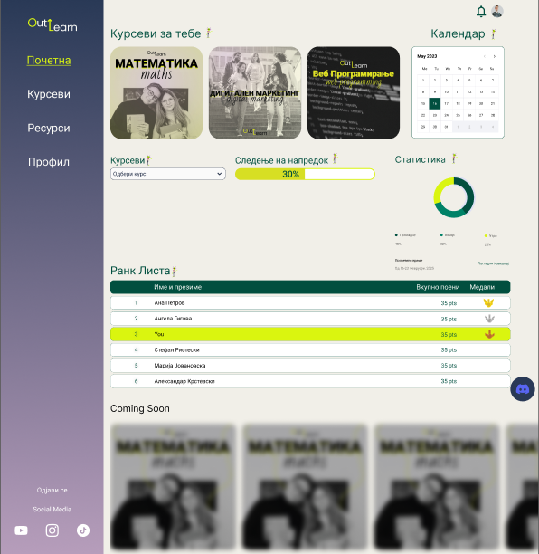
🎨 Designing Your Product
Design System Highlights:
- Color palette: #D2232A (#Primary), #2A3A57 (Secondary), #024F40 (tertiary), #DAF50F (4th Color), #E6BFDD (5th Color), #F1EFE8 (Background)
- Typography: Roboto

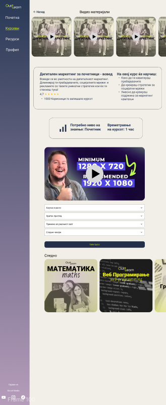
🛠️ Prototyping
Interactive prototype demonstrating user flow
Tools Used:
- Figma
🎉 DING! All Done
Final outcome: While we received positive feedback from the clients for our innovative approach and design, we were ultimately not selected for the project. However, our mascot, "Ollie" became a standout figure, symbolizing wisdom and adaptability throughout the design process.