Mirjana Josifoska - Hats
The Challenge
In today’s competitive e-commerce landscape, user experience is the key differentiator. For Mirjana Josifoska, a brand known for its unique, customizable hat collection, the marketplace page is a vital touchpoint where the magic of personalized fashion begins. My mission was to revamp this marketplace interface, aligning it with the brand’s ethos of style, simplicity, and personalization. As one man team, I tackled this challenge with a user-centered approach, delving deep into user pain points, analyzing behaviors, and crafting a strategic plan for improvement. The goal was to transform the marketplace into an intuitive, delightful space, guiding users effortlessly from product discovery through customization to checkout. This case study captures our journey from initial research to prototype, showcasing our process, insights, and the decisions that shaped a streamlined, engaging, and user-friendly experience that meets both user expectations and business goals.
Problem Statement
The challenge was to create a seamless Shopify site that simplifies the multi-step checkout process, ensuring a smooth and enjoyable shopping experience. By addressing user pain points, I aimed to design an intuitive platform that combines functionality with aesthetic appeal, making online shopping effortless and delightful.
🔍 Researching
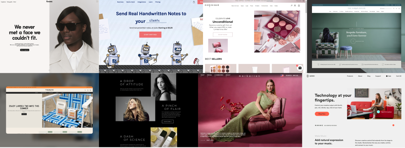
Analyzing similar platforms like Ercegovac Hats, Dulsineja, and Miss Spice gave me valuable insights into effective design strategies for hat-focused e-commerce. I observed best practices in product categorization, filter systems, and the emphasis on customization features. These insights helped me identify areas where I could improve Mirjana Josifoska 's marketplace, ensuring a more intuitive and user-friendly experience tailored to hat enthusiasts.
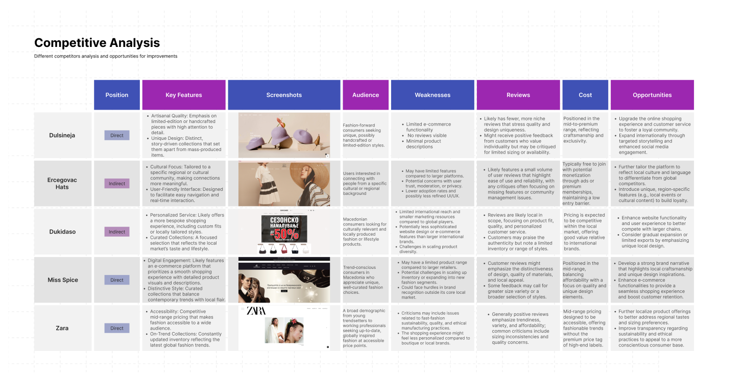
Through the competitive analysis, I identified gaps in the market that competitors had overlooked, enabling us to meet unfulfilled customer needs and enhance our marketing approach. For instance, while one competitor stands out for excellent customer service, their premium pricing opened a window for us to appeal to budget-conscious buyers. The analysis also underscored the value of social media engagement, motivating us to implement similar strategies to increase brand visibility. This process ultimately sharpened our unique value proposition and guided strategic decisions across teams to foster growth.
👥 Creating Your Average User’s Needs
User Persona
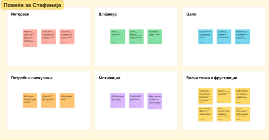
Key Needs:
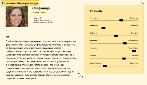
I shifted my focus to Stefanija, the "Safe Shopper," who embodies the cautious yet style-conscious buyer. Stefanija, identified as a result of a user survey, values a seamless and trustworthy shopping experience, especially when it comes to purchasing hats online. Safe Shopper: Seek detailed product descriptions and high-quality images to make informed decisions. Appreciate a narrative-driven interface that tells the story behind each hat, connecting them emotionally to the product. Prefer a user-friendly design that ensures a secure and hassle-free checkout process. To address these needs, I developed a user persona that highlights Stefanija's journey, emphasizing trust, storytelling, and an intuitive shopping flow.
📊 Analyzing
Analyzing the layout of other products, I came to the conclusion that there is a definite need to give elements the need to breathe. The moodboard is the result of a minimalist layout that emphasizes user experience, ensuring that every element serves a purpose and contributes to a seamless interaction.
Based on these insights, I created a curated user flow that streamlines everything discovered in the moodboard, ensuring a cohesive and intuitive journey for the user.
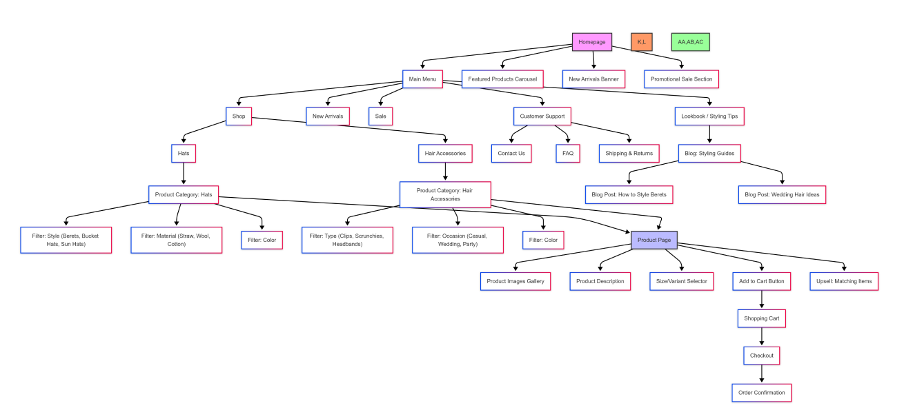
🗺️ Mapping Your Product
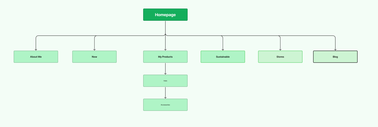
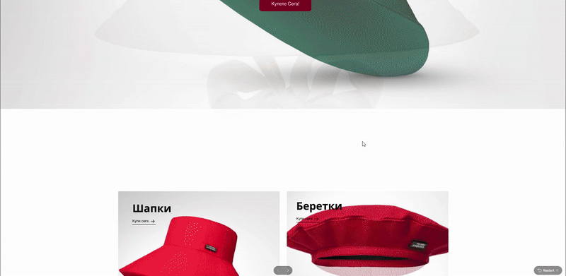
As I mapped out the product journey, it became clear that the user experience needed a transformation. Imagine a shopper stepping into a boutique, where every step naturally guides them closer to finding their perfect hat. This vision inspired me to refine the flow, ensuring that product categories were thoughtfully organized, displays were inviting, and customization options stood out like a friendly shopkeeper ready to assist. By crafting this intuitive path, I aimed to eliminate confusion and create an engaging experience that effortlessly led users from discovery to personalization and beyond.
📐 Framing Your Wires
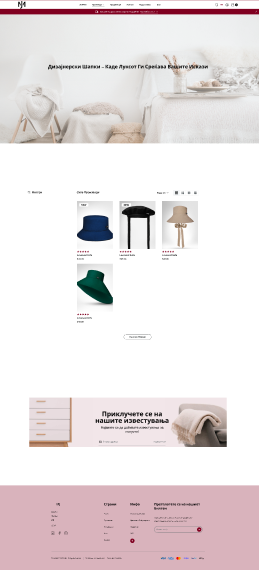
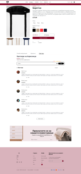
I designed a clean, minimalist wireframe that prioritized easy navigation. Key features like product categories, filters, and customization options were prominently placed for quick access, while unnecessary elements were removed to reduce visual clutter.
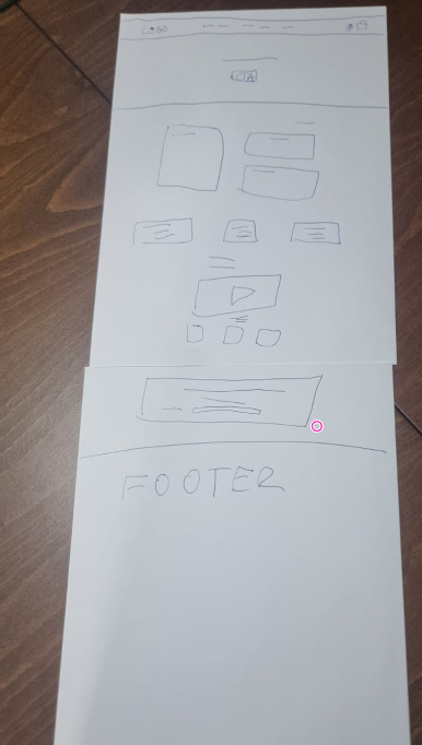
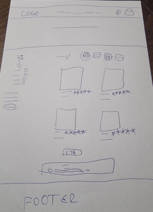
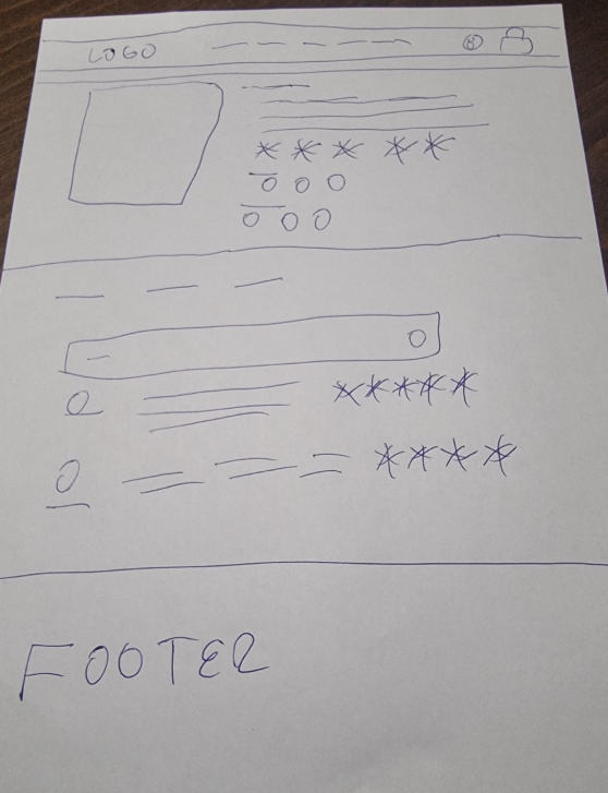
Additionally, I ensured that the customization options were easily discoverable. The wireframes emphasized clear calls-to-action for personalization, creating an intuitive flow that guided users smoothly through the gift selection and customization process. This helped set the stage for a user-friendly, personalized experience.
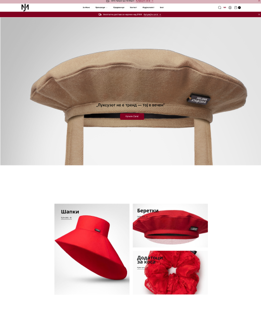
🎨 Designing Your Product
Design System Highlights:
- Color palette: #800020 (primary), #F2E6E9 (secondary), #6C7275 (tertiary), #D9B3BC (4th color), #FFFFFF (background), #000000 (text)
- Typography: Adobe Garamond Pro and Helvetica Neue
🛠️ Prototyping
Interactive prototype demonstrating the product and the flow itself.
Tools Used:
- Figma
🎉 DING! All Done
The journey has been nothing short of exhilarating. From the initial spark of an idea to the final prototype, every step was a testament to creativity, dedication, and a relentless pursuit of excellence. The result? Well, it’s still pending, but I can’t help but feel a sense of accomplishment. I poured my heart into this project, crafting a solution that not only meets the brief but also exceeds expectations. If passion and hard work are any indicators, I believe I’ve earned the title of the winner. Fingers crossed!